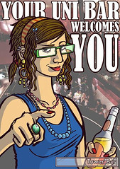
The second of two flyers for a student union bar up north. This guy was actually based on a friend-of-a-friend who seemed to fit the student stereotype look perfectly. However, I don't think he knows he's been immortalised in advertisement form yet...
Tuesday, 25 November 2008
Bar flyer 1 of 2
Funnily enough, this was done for the same student bar that wanted the food images below...thankfully, they also requested these flyer designs have student-based characters in them, and having just been at uni for three years I had plenty of reference!
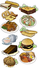
Food!
This remains my oddest commission to date - doing eleven drawings of foodstuffs based around a menu at a student union bar in the north of England. Whether or not I'll get anything wierder than this in the near future is anyone's guess!
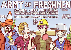
Army Of Freshmen
A gig poster for an American pop-punk band, as requested by my old local music venue at Swindon where I studied at uni. This took a relatively short amount of time to do seeing as the characters are supposed to be college students, so it wasn't really a stretch of the imagination to picture what an army of them would look like...
Lipstick Revolution
A t-shirt design for a local electro-punk band...I was given a brief that indicated a preferred Eighties approach, so I just went all-out on the style and colours and had enormous amounts of fun doing it!
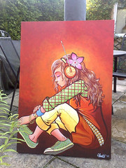
Lost In Sound
I've been using pen, ink and Photoshop for a fair while now, so understandably the prospect of picking up my brushes and acrylics for a canvas piece was more than a little daunting - that said, I did end up enjoying it, and I'm planning on doing more in the future. So watch this space...
Dash Render
Although the band never materialised in the end, I'm still happy to have grabbed this opportunity for a spot typography-based design...I went for a cheesy retro glam look, and considering I haven't had a bash at doing this properly before it didn't go quite as appallingly as I thought it might!
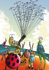
Wind Power
The third and final of a set of novel illustrations for an exhibit in August. I wanted to explore the artworks of children's books, so I picked one of my favourite stories from when I was a kid - Roald Dahl's 'James And The Giant Peach'. This was a joy to draw and colour, if a bit wierd after the detail of the previous two pieces, but it's ended up being my favourite of the three.
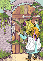
The Secret Garden
The second of three novel illustrations for a gallery showing a few months back, and this time, I explored the visual potential of Frances Hodgson Burnett's 'The Secret Garden'. The leaves were a bit of the pain, and referencing what I could from grainy turn-of-the-century photos proved a slight challenge, but generally speaking I was loving the opportunity to indulge in a bit of extra detail!
Nemo's in for it now...
One of three example illustrations for famous novels, produced for a gallery exhibition in the summer - this one being for Jules Verne's '20,000 Leagues Under The Sea'. From doing this, I have come to the following conclusion: squid tentacles are a NIGHTMARE to draw...
Subscribe to:
Comments (Atom)


